This is one type of a misleading graph.
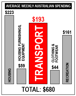
Discussion points
-
What is the title of the graph?
-
What is being represented on the horizontal axis?
-
What is being represented vertically?
-
In a bar graph the area of a bar is proportional to the quantity represented in the bar, so how is this graph misleading?
-
What percentage of the weekly spending is spent on transport?
-
What percentage of the amount spent on transport would the area shown on the graph appear to represent?
-
Why do you think the reporter produced this plot?
-
Explain why we cannot find a median for this data set.
Suggested answers for misleading area graphs can be downloaded.